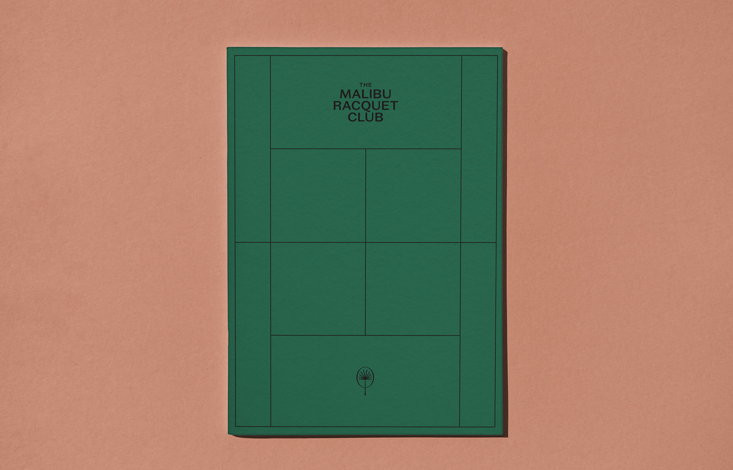
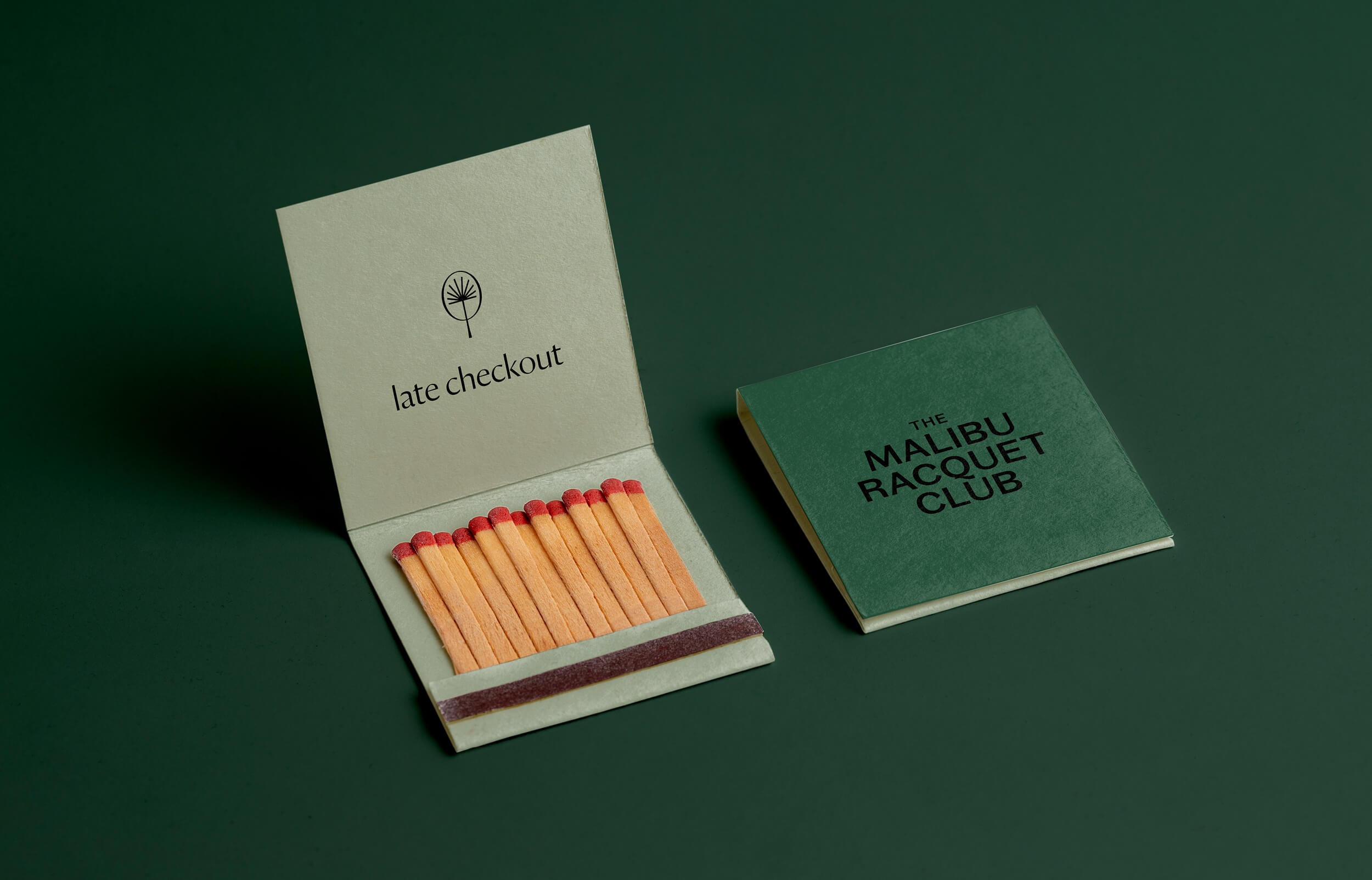
The Malibu Racquet Club
Serving a Quality Shot
The brief was to create a visual identity embodying the distinguished membership-based Malibu Racquet Club situated in the oceanside hills of Malibu, California.
Our response was a light-hearted, friendly and eye-catching brand with a clean graphic approach and a crisp attitude to reflect the informality and personality of the new Burleigh Heads cocktail bar and raw menu haunt, serving both locals and visitors.
The brandmark reflects the agave plant, palm, and racquet through a combination of shapes to create the playful, geometric paddle-shaped icon. The brand’s simplicity is complemented by a colour palette that captures the arid tones of the Mexican landscape through to the hard-surfaced outdoor courts.
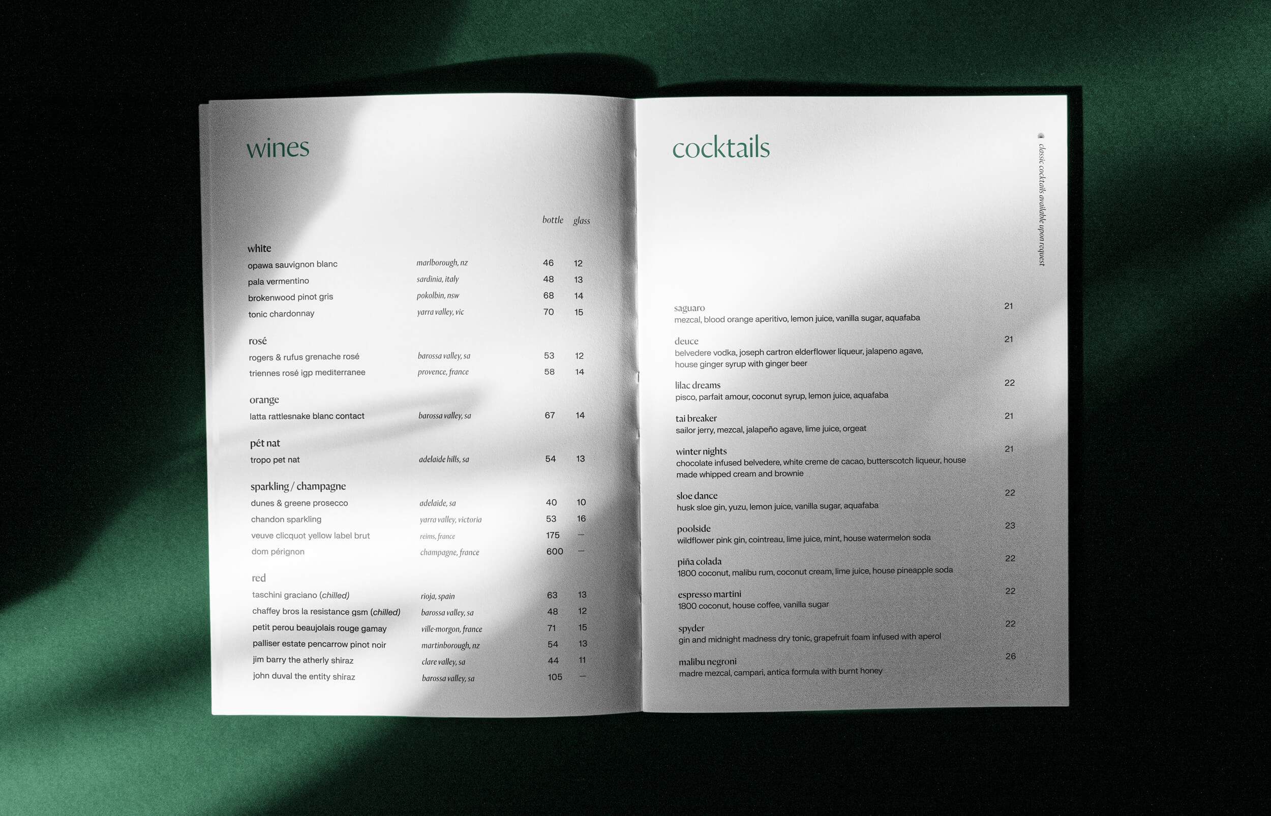
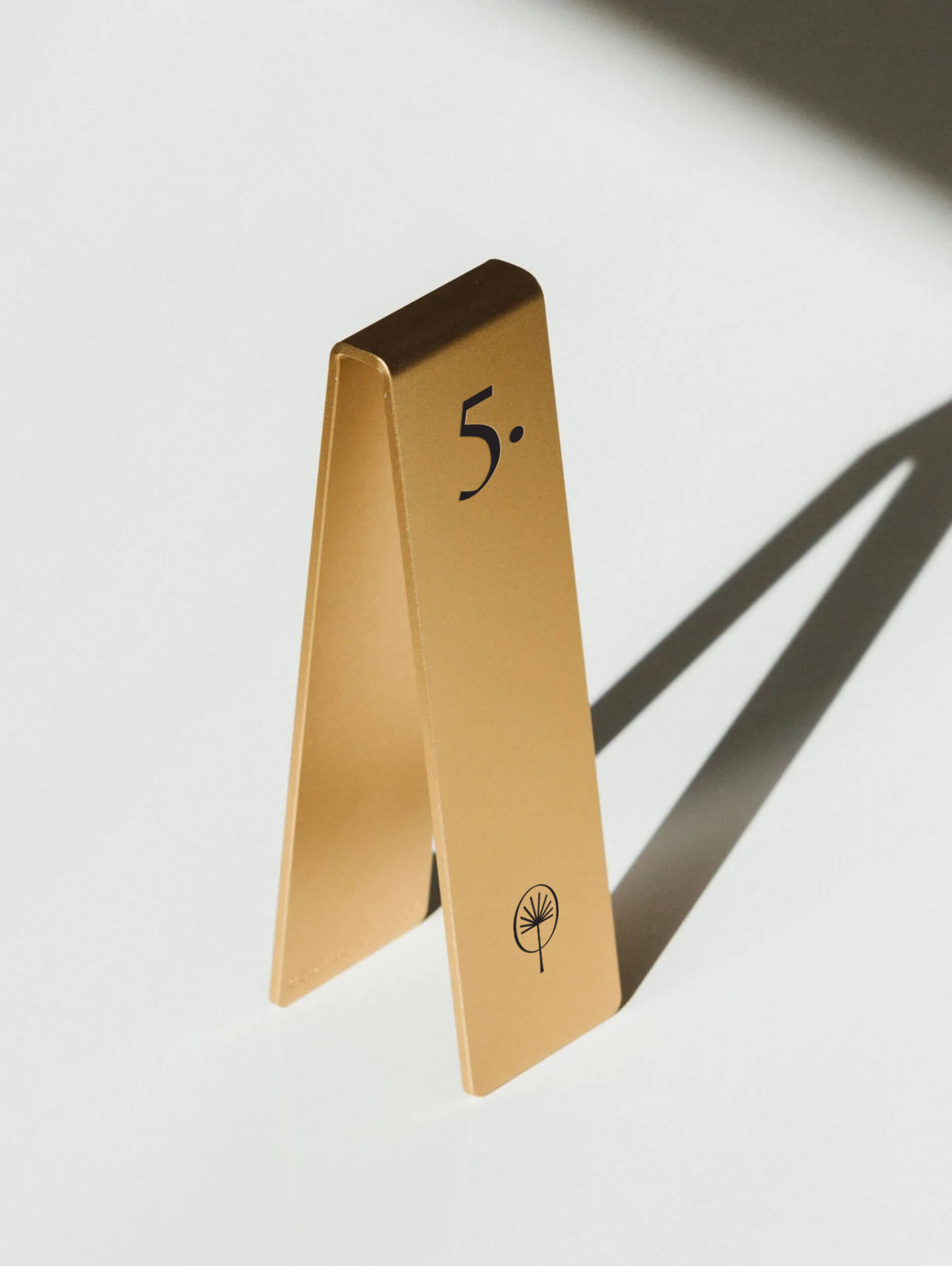
With its nostalgic charm and modern undertones, the visual identity conjures up layers of theming and additional narrative in the bar as it features tennis court-inspired menus, coasters, brass ice stamps, uniforms and embroidered reservation sweat towels crafted using carefully selected materials — game, set and match.
Welcome to the club.